Inspired by my recent efforts to handcraft Ansible inventory graphs, and wanting to be able to quickly see what groups are used for a particular host in Ansible inventory, I decided to generate some graphs.
There is a useful discussion on ansible-devel and I know @svg is doing more work on improving ansible inventory so hopefully things will yet get easier.
My solution uses Ansible’s inventory libraries where possible, and then generates a GraphViz DOT file format in quite an opinionated fashion (currently there is no way to choose fonts or shapes, the program chooses for you!)
The result is in my ansible-inventory-grapher Github repo and I have an example from my ansible-ec2-example inventory:
$ bin/ansible-inventory-grapher
Usage: ansible-inventory-grapher [options] host1 [host2 ...]

Options:
  -h, --help       show this help message and exit
  -i INVENTORY
  -d DIRECTORY     Location to output resulting files [current directory]
  --format=FORMAT  python format string to name output files
                   ["{hostname}.dot"]

$ bin/ansible-inventory-grapher -i ../ansible-ec2-example/inventory/hosts prod-web-server-78a prod-web-server-28a -d test --format "test-{hostname}.dot"
(The above assumes that you’ve downloaded both repositories under a common parent - I use ~/src/)
The resulting graphs can then be converted to pngs using:
for f in test/*.dot ; do dot -Tpng -o test/`basename $f .dot`.png $f; done(Again, the above assumes graphviz is installed - use your package manager of choice for that - yum, apt-get, brew, chocolatey(?))
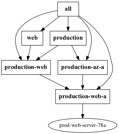
That then results in a reasonable looking inventory graph for e.g. prod-web-server-78a:
Improvements
- Better customisation of appearance (fonts, node styles etc)
- Optionally include what variables come from which group
- Offer other output formats than DOT format